QuickStart
Install TkGridGUI
The easiest way to install TkGridGUI is:
pip install tkgridgui

    OR on Linux
sudo pip install tkgridgui
    OR perhaps
pip install --user tkgridgui
Installation From Source
Much less common, but if installing from source, then
the best way to install tkgridgui is still pip.
After navigating to the directory holding TkGridGUI source code, do the following:
cd full/path/to/tkgridgui
pip install -e .

    OR on Linux
sudo pip install -e .
    OR perhaps
pip install --user -e .
This will execute the local setup.py file and insure that the pip-specific commands in setup.py are run.
Verify tkinter
In Theory tkinter is included with all standard Python distributions. (In practice, it might not be included.) It’s almost certainly there on a Windows machine, however, on Linux you might have to try:
sudo apt-get update
sudo apt-get install python-tk
sudo apt-get install python3-tk
In order to get Tkinter/tkinter for python 2 & 3.
You can test the installation from a terminal window with:
>>> import Tkinter       # python2
>>> Tkinter._test()      # python2

>>> import tkinter       # python3
>>> tkinter._test()      # python3
This should pop up a small test window.
Running TkGridGUI
After installing with pip a launch command line program called tkgridgui or,
on Windows, tkgridgui.exe will be in your machine’s system path.
Simply typing:
tkgridgui
will run TkGridGUI.
If not, then there may be an issue with your system path. The path for the tkgridgui executable might be something like:
/usr/local/bin/tkgridgui             (if installed with sudo pip install -e .)
     or
/home/<user>/.local/bin/tkgridgui    (if installed with pip install -e .)
     or
C:\Python27\Scripts\tkgridgui.exe    (on Windows)
Make sure your system path includes the proper path above.
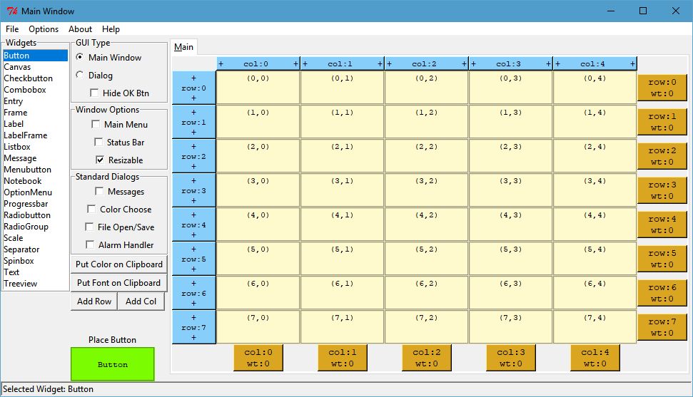
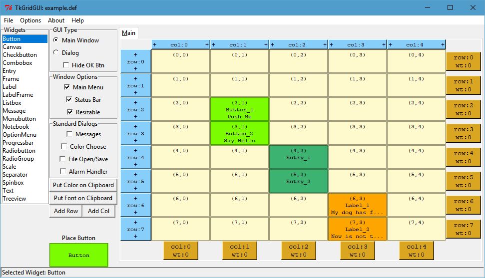
Grid Notebook
When TkGridGUI launches, it presents the grid notebook shown below. When first opened, only the “Main” tab is on the notebook, however, as container widgets like Frames or RadioGroups are placed, their tabs will appear.
Widgets are selected from the listbox at the far left and are placed on the grid notebook with a left click. The widget to be placed is also highlighted at the lower left (in the example below, a green Button).
If additional rows or columns are needed, they can be inserted with the “+” operators along the blue upper and left side controls.
If weights are needed to control widget size when the main window is resized, the gold “wt” controls along
the bottom and right side can be used. (don’t forget to set the sticky attribute of any widgets to be
controlled by weight).
Additional features such as Main Menu or Status Bar can be selected with the check boxes along the left.
Click Image to View Fill Size
Basic Usage:
  Select Widget in Listbox with Left Click.
  Place Widget with Left Click in grid.

Edit Widget:
  Right Click Widget in Grid or Preview Window.

Move Widget:
  Left Button Drag and Drop in Grid.

Duplicate Widget:
  Left Click Widget in Grid.
  Left Click in grid to place the duplicate.

Insert Row or Column with Left Click on "+" control.

Add Weight to row or column with "wt" control.

Select Corresponding Tab for Widgets in Frames, RadioGroups etc.
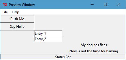
Preview Window
As widgets are added, the preview window will show the current state of the widgets in the application.
Click Image to View Fill Size
Widget Attributes
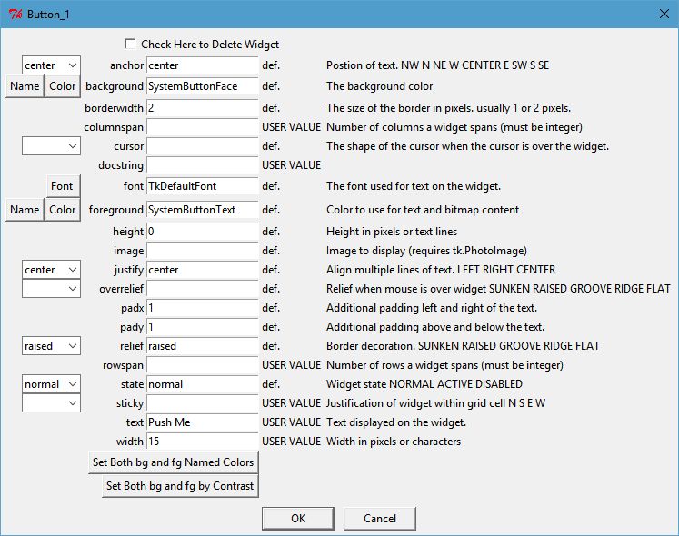
Right click on a widget either in the Preview Window or the Grid Notebook to set its properties.
The example below shows the options available for a Button widget.
Note that for Color or Font, there are pop-up dialogs to select values for color or font.
Many of the options have drop-down selections for enumerated inputs like relief, state, cursor, etc.
Click Image to View Fill Size
Contrast Ratio
For widgets with a foreground and background color, a color selection control is present that helps select colors that comply with WCAG 2 Contrast Ratio guidance.
Contrast Ratio WCAG 2 see: https://en.wikipedia.org/wiki/Template:Color_contrast_ratio
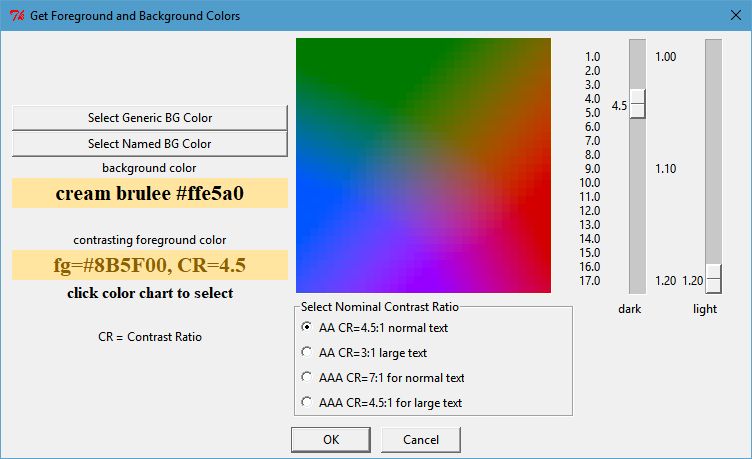
Click Image to View Fill Size
Save Tkinter Application
When the GUI has been designed to your liking, or at various stages along the way, you can save your work with the menu option File/Save.
Two files are saved…
An application definition file (*.def) that defines all the application’s attributes.
A python source code file (*.py) with all of the Tkinter implemented statements.
Definition File
The definition file is structured like a configuration file with the overall attributes in the section call [app_attr] and each widget like [Button_1] etc. shown below that.:
[app_attr]
hideokbutton = no
hasstddialmess = no
add_menu_ctrl_keys = yes
name = example
guitype = main
hasstdalarm = no
menu = File\n  New\n  Open\n  Save\n\n  Exit\nHelp\n  Sounds\n    Moo\n    Meow
resizable = yes
hasmenu = yes
height = 151
width = 425
hasstddialcolor = no
col_weights =
row_weights =
hasstddialfile = no
y = 55
x = 1107
hasstatusbar = yes

[Button_1]
widget_type = Button
tab_label = Main
row = 2
col = 1
rowspan =
text = Push Me
docstring =
width = 15
columnspan =

[Button_2]
widget_type = Button
tab_label = Main
row = 3
col = 1
.
.
.
Python Tkinter File
The generated python code is designed to run under both python 2 and 3.
As such the import section checks for python version.
if sys.version_info < (3,):
    from future import standard_library
    standard_library.install_aliases()
    from ttk import Combobox, Progressbar, Separator, Treeview, Notebook
else:
    from tkinter.ttk import Combobox, Progressbar, Separator, Treeview, Notebook

from tkinter import *
All of the widgets are created by their own make method in order to organize the code.
self.make_Button_1( self.grid_frame ) #  Button: Push Me : at Main(2,1)
self.make_Button_2( self.grid_frame ) #  Button: Say Hello : at Main(3,1)
self.make_Entry_1( self.grid_frame )  #  Entry:  at Main(4,2)
self.make_Entry_2( self.grid_frame )  #  Entry:  at Main(5,2)
self.make_Label_1( self.grid_frame )  #  Label: My dog has fleas : at Main(6,3)
self.make_Label_2( self.grid_frame )  #  Label: Now is not the time for barking : at Main(7,3)
Menu items create keyboard accelerator keys by default.
# use both upper and lower characters for keyboard accelerator options.
self.master.bind("<Control-N>", lambda event: self.menu_File_New())
self.master.bind("<Control-n>", lambda event: self.menu_File_New())
self.master.bind("<Control-O>", lambda event: self.menu_File_Open())
self.master.bind("<Control-o>", lambda event: self.menu_File_Open())
self.master.bind("<Control-S>", lambda event: self.menu_File_Save())
self.master.bind("<Control-s>", lambda event: self.menu_File_Save())
self.master.bind("<Control-E>", lambda event: self.menu_File_Exit())
self.master.bind("<Control-e>", lambda event: self.menu_File_Exit())
User Code Areas
In general the generated python code is intended to be augmented with user code.
That user code is protected from change at each TkGridGUI Save command by placing it in
protected user code areas.
For example, each widget’s make method has an area for user code marked by comments so that save operations
do not overwrite customizations to the basic generated python code.
In the Button_1 example below, the text, width, row and column attributes will be overwritten every time TkGridGUI saves the file.
The bind command, however, will not be overwritten because it is in the protected user code area.
# TkGridGUI generated code. DO NOT EDIT THE FOLLOWING. section "make_Button_1"
def make_Button_1(self, frame):
    """      Button: Push Me : at Main(2,1)"""
    self.Button_1 = Button( frame , text="Push Me", width="15")
    self.Button_1.grid(row=2, column=1)

    # >>>>>>insert any user code below this comment for section "make_Button_1"

    self.Button_1.bind("<ButtonRelease-1>", self.Button_1_Click)
The same idea applies to the Button_1_Click method.
When the button is clicked, the user code will be executed and that code is protected from overwrite from TkGridGUI.
# TkGridGUI generated code. DO NOT EDIT THE FOLLOWING. section "Button_1_Click"
def Button_1_Click(self, event): #bind method for component ID=Button_1
    """      Button: Push Me : at Main(2,1)"""

    # >>>>>>insert any user code below this comment for section "Button_1_Click"
    # replace, delete, or comment-out the following
    print( "executed method Button_1_Click" )
    self.statusMessage.set("executed method Button_1_Click")
User code is protected for the automatically generated StringVar callback routines.
Whenever the value of the Entry_1_StringVar changes, this method is called.
# TkGridGUI generated code. DO NOT EDIT THE FOLLOWING. section "Entry_1_StringVar_traceName"
def Entry_1_StringVar_Callback(self, varName, index, mode):
    """       Entry:  at Main(4,2)"""

    # >>>>>>insert any user code below this comment for section "Entry_1_StringVar_traceName"
    # replace, delete, or comment-out the following
    print( "Entry_1_StringVar_Callback varName, index, mode",varName, index, mode )
    self.statusMessage.set("    Entry_1_StringVar = "+self.Entry_1_StringVar.get())
    print( "    new StringVar value =",self.Entry_1_StringVar.get() )
The automatically generated Menu routines also have user code areas.
Placing user menu logic in the protected user code area prevents TkGridGUI from overwriting
it on Save operations.
# TkGridGUI generated code. DO NOT EDIT THE FOLLOWING. section "menu_File_New"
def menu_File_New(self):

    # >>>>>>insert any user code below this comment for section "menu_File_New"
    # replace, delete, or comment-out the following
    self.statusMessage.set("called menu_File_New")
    print( "called menu_File_New" )