Examples
Named Color Dialog
The dialog for picking named colors within TkGridGUI was created by TkGridGUI.
The two images below show the dialog before and after a color is selected.
The objective of the dialog is to present named colors to the user for selection.
As an aid to selection, the colors can be sorted in four different ways; by hue, luminance, hex code or color name.
Once selected, the large Label at the top of the dialog uses the selected color as its background and gives the name, hex value, luminance, and contrast ratio with either white or black foreground depending on which is better.
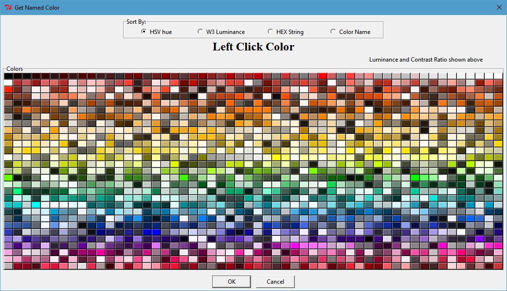
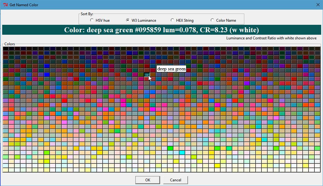
Click Image to View Fill Size
The names of colors are taken from Name that Color JavaScript by Chirag Mehta
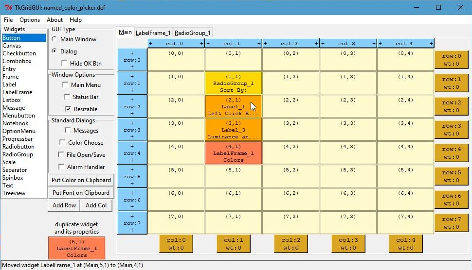
TkGridGUI Layout
The TkGridGUI layout for this project is very simple, just 4 widgets on the Main tab and two additional container tabs; an empty LabelFrame and a RadioGroup.
Each widget was selected from the listbox at the far left (labeled Widgets) and placed into the grid by Left Clicking at each grid location ((1,1) through (4,1)).
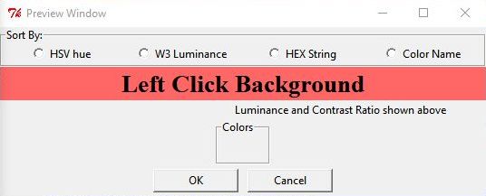
Note that when the mouse is over a widget on the grid interface (see Label_1 at (2,1) below) that the same widget is highlighted in the preview window (see the red Label_1 in the preview window below).
Click Image to View Fill Size
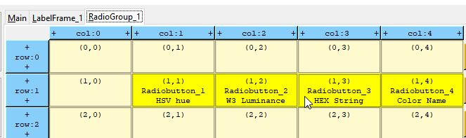
The RadioGroup tab holds ONLY RadioButtons by definition. The images below show the grid layout and preview for the RadioGroup_1 tab.
Again note the mouse-over highlight feature.

User Code
The empty Colors LabelFrame_1 is populated entirely with user code.
Each color has a Label object that has bind attributes to enable a mouse-over pop-up that shows the color’s name, as well as Left Click selection.
# >>>>>>insert any user code below this comment for section "top_of_init"

self.labelD = {} # index=(row,col): value=Label object
row = 0
col = 0
for (lum, lum_p05, h, r, g, b, cstr, name) in h_sorted_colorL:
    lab = Label( self.LabelFrame_1 , text="  ", width="3", padx=0, pady=0,
                 font=("times", "6", "normal"))
    lab.grid(row=row, column=col)
    self.labelD[ (row,col) ] = lab
    lab.configure( background=cstr, relief="raised" )

    lab.bind("<Enter>", self.label_enter)
    lab.bind("<Leave>", self.label_leave)
    lab.bind("<ButtonRelease-1>", self.ColorPickLabel_LeftClick)

    col += 1
    if col>=COL_COUNT:
        col = 0
        row += 1
In the validate method, the dialog returns the user selection in the result dictionary.
def validate(self):
    self.result = {} # return a dictionary of results

    # >>>>>>insert any user code below this comment for section "dialog_validate"
    # set values in "self.result" dictionary for return

    self.result["named_color"] = self.named_selectionT
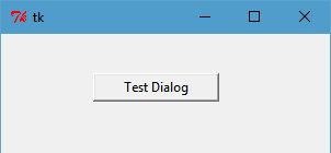
Test Dialog
Note that every dialog created by TkGridGUI automatically includes a Testdialog feature that runs when the python file is run stand-alone.
class _Testdialog:
    def __init__(self, master):
        frame = Frame(master, width=300, height=300)
        frame.pack()
        self.master = master
        self.x, self.y, self.w, self.h = -1,-1,-1,-1

        self.Button_1 = Button(text="Test Dialog", relief="raised", width="15")
        self.Button_1.place(x=84, y=36)
        self.Button_1.bind("<ButtonRelease-1>", self.Button_1_Click)

    def Button_1_Click(self, event): #click method for component ID=1
        dialog = named_color_picker(self.master, "Test Dialog")
        print( '===============Result from Dialog====================' )
        print( dialog.result )
        print( '=====================================================' )

def main():
    root = Tk()
    app = _Testdialog(root)
    root.mainloop()

if __name__ == '__main__':
    main()
WorkFlow
For both Dialogs and Main Applications the workflow consists of:
* Position Widget in TkGridGUI
* Edit Widget Properties in TkGridGUI
* Save to Generated Python File
* In Source Code Editor, Modify User Code
* Run Python File Stand-Alone
* Refactor/Make Corrections
* Repeat Cycle
While this is not a perfect implementation of Test Driven Development , it captures one of the main ideas behind TDD that development relies on the repetition of a very short development cycle.
Each change to the GUI under development can be incremental and can be tested incrementally.
Cross-Platform Font Dialog
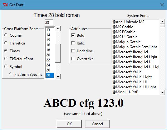
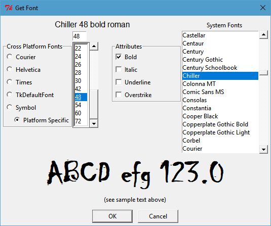
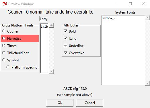
The dialog for picking fonts within TkGridGUI was created by TkGridGUI.
The two images below show the dialog with a cross-platform font selected (Times) and with a platform-specific font selected (Chiller).
The objective of the dialog is to present several cross-platform fonts to the user for selection using the Radiobuttons along the upper left, or any of the detectted system fonts in the Listbox along the upper right. Additional attributes of the font can be set with the Checkbutton controls labeled Bold, Italic, Underline and Overstrike. The font size can be selected from the numeric Listbox or set manually in the Entry control just above that Listbox.
Once selected, the Label at the top of the dialog describes the choice (Times 28 bold roman) and (Chiller 48 bold roman) in the examples below.
The label spanning the width of the dialog just above the OK and Cancel buttons show the font as it displayed by a label.configure(font=selected_font) command.
Click Image to View Fill Size
TkGridGUI Layout
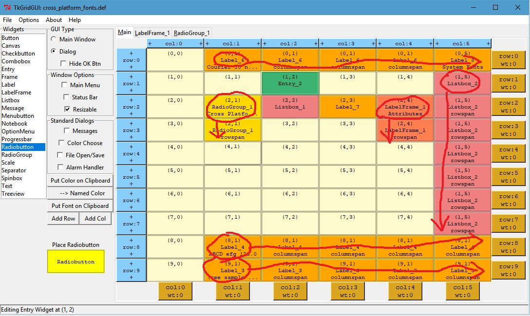
The TkGridGUI layout for this project is shown below. Many of the widgets on the Main tab use rowspan and columnspan to achieve the desired layout (see impage marked in red below).
Rowspan and columnspan are applied by Right-Clicking a widget on the grid after it is placed and entering the desired integer value for the number of rows or columns to be spanned.
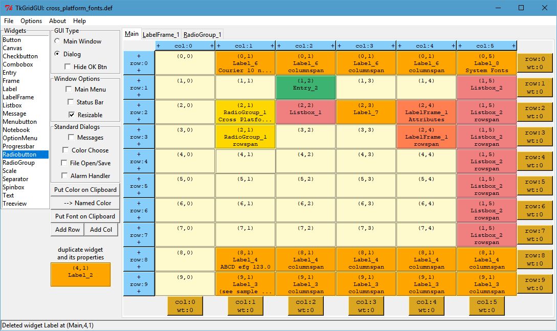
RadioGroup_1 holds the Cross-Platform Font selections and is designed as shown below.
Note that when the mouse is over a widget on the grid interface (see Radiobutton at (2,0) below) that the same widget is highlighted in the preview window (see the red Helvetica Radiobutton in the preview window below).
The Checkbuttons are placed into LabelFrame_1 for the font Attributes in a very similar manner.

User Code
User code is inserted below the # >>>>>>insert any user code comment lines in each of the generated methods.
For example, some initialization was done in the fonts dialog to set the default font to Helvetica size 10.
# >>>>>>insert any user code below this comment for section "top_of_init"

self.RadioGroup_1_StringVar.set("2") # make Helvetica the default
self.current_font_name = 'Helvetica'
self.Entry_2_StringVar.set( '10' )
In the validate method, the dialog returns the user selection in the result dictionary.
The selected font is returned both in string form and in tuple form.
def validate(self):
    self.result = {} # return a dictionary of results

    # >>>>>>insert any user code below this comment for section "dialog_validate"

    t = self.full_font_desc
    self.result["full_font_desc"] = t # return the tuple
    self.result["full_font_str"] = t[0].replace(' ','\ ') + ' %i '%t[1] + ' '.join(t[2:])

    return 1
Test Dialog
Note that every dialog created by TkGridGUI automatically includes a Testdialog feature that runs when the python file is run stand-alone.
WorkFlow
The workflow for the font dialog is exactly the same as it was for the named color dialog above and consists of:
* Position Widget in TkGridGUI
* Edit Widget Properties in TkGridGUI
* Save to Generated Python File
* In Source Code Editor, Modify User Code
* Run Python File Stand-Alone
* Refactor/Make Corrections
* Repeat Cycle